Simplifying a high-stakes onboarding journey
Fintech · Financial coaching · Consumer app
Designing a 100+ question onboarding flow into an 18-screen journey that people could actually complete, without feeling overwhelmed, embarrassed, or lost.
This project focused on reducing cognitive burden and emotional friction in a high-stakes financial moment, while balancing business growth goals with accessibility standards.
My role
Principal / Leading Product Designer
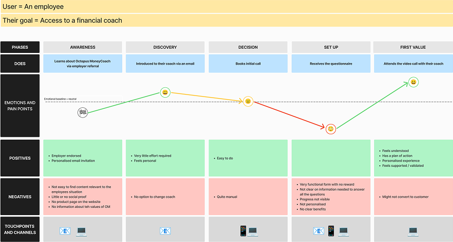 The user journey map that helped us understand the highs and lows from each onboarding touch-point.
The problem
The user journey map that helped us understand the highs and lows from each onboarding touch-point.
The problem
When I joined Octopus MoneyCoach as the first design hire, onboarding reflected the company's deep financial expertise but had UX problems. It asked over 100 questions upfront, users were expected to understand complex terminology, recall precise figures, and make confident decisions about pensions, debt, inheritance, and their children's futures.
People weren't arriving in calm, rational states. They were anxious, embarrassed, and often unsure of the answers. The flow created high cognitive load, frequent drop-off, and real accessibility risk. If someone left to find a missing number, they lost their progress and had to start again.
The problem wasn't volume. It was emotional and cognitive burden. The business needed structured, detailed data. Users needed clarity, reassurance, and breathing space. The system served neither well.
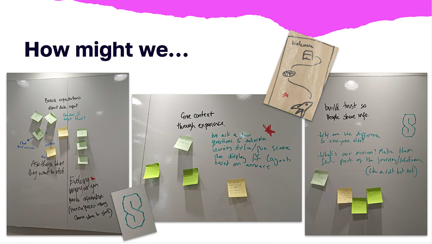 Onboarding workshop to brainstorm ideas and promote alignment with stakeholders.
What I did
Onboarding workshop to brainstorm ideas and promote alignment with stakeholders.
What I did
My team and I reframed the challenge from "How do we fit all the questions into onboarding?" to "How might we keep users engaged while collecting everything we need?"
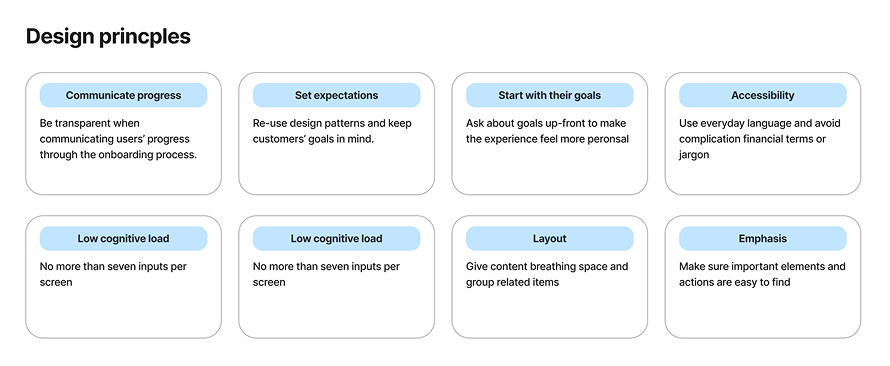
That shift moved us from compressing content to redesigning the experience architecture. We agreed on principles early: make progress visible, introduce complexity only when necessary, limit each screen to a small set of decisions, write for accessibility first.
Rather than treating accessibility as a constraint to handle at the end, we involved it from the start. That reduced rework and positioned design as a way to lower risk, not introduce it.
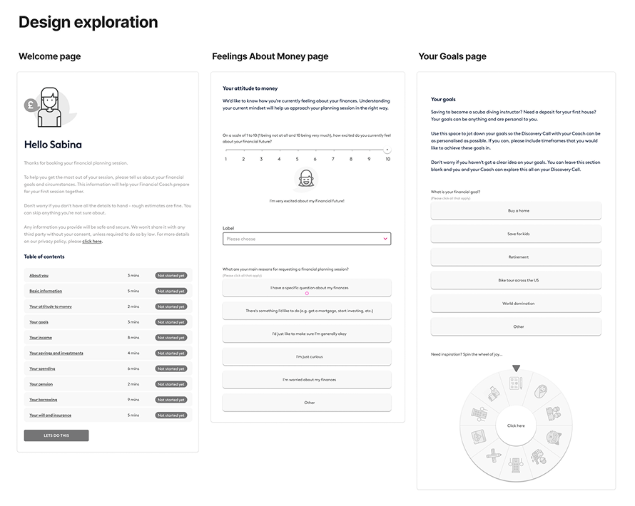 The design exploration included a table of contents up front, using micro animations for sliders and spinning wheels to prompt ideas to introduce an element of fun.
What shipped
The design exploration included a table of contents up front, using micro animations for sliders and spinning wheels to prompt ideas to introduce an element of fun.
What shipped
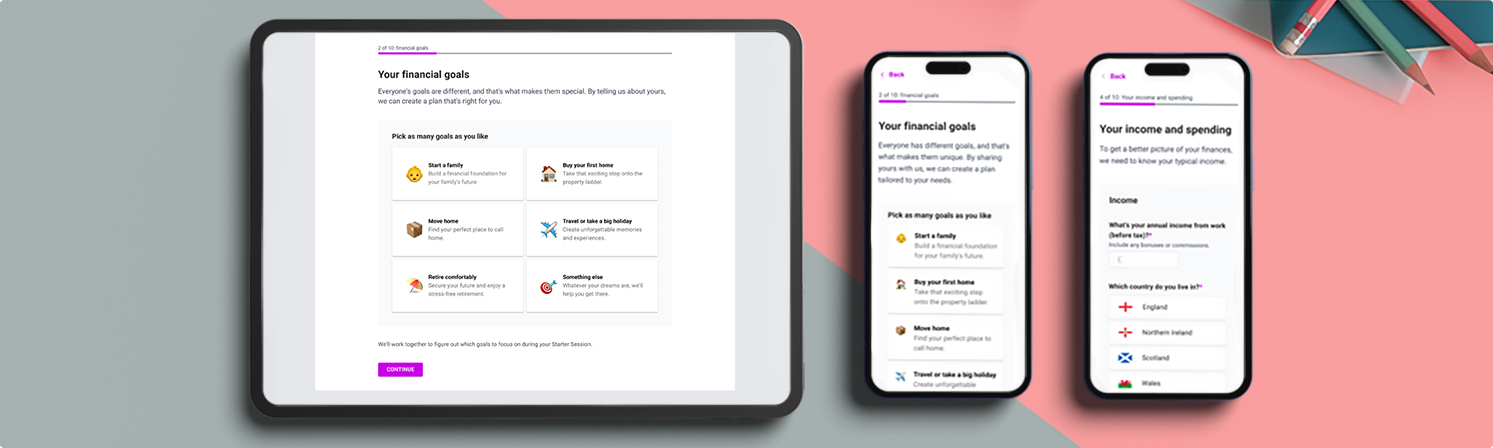
We rebuilt the onboarding journey from the ground up. Non-essential questions were removed, and the remaining 80+ were reorganised into 18 structured screens covering income, spending, savings, investments, pensions, protection, and insurance.
Follow-up questions appeared only when triggered by previous answers (inspiraed by the gov.uk's design system "reveal" component), language was rewritten in plain English, error states were designed to reassure rather than blame, clear progress indicators and consistent interaction patterns reduced effort and anxiety at every step.
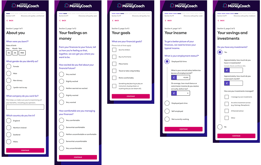
Mobile-first designs with accessibility of both the written content and UI elements was front and centre of the designs.
View the interactive Figma prototype
Completion rates improved and drop-off fell. The redesigned journey now supports onboarding for over 200,000 employees through employer partnerships.
Clarity scaled. Complexity didn't.
What I'd do differently
The biggest limitation was not having access to user research at the start. The reframe came from instinct and stakeholder alignment rather than validated insight, which meant some assumptions had to be corrected in later iterations.
Getting all the stakeholders in the room early was one of the better decisions we made. It changed the dynamic from design defending its choices to the whole team solving the same problem. That's worth replicating on any project where regulation touches the user experience.