Designing for scale
Fintech • B2B SaaS • design systems • engineering collaboration.
Building and evolving a scalable design system from a basic MUI foundation to a multi-product, token-based architecture aligned with Storybook. The goal was reduce accessibility risk, improve engineering throughput, and enable the platform to scale across products, brands, and partners.
90%
This was not about creating a UI kit. It was about creating stability.
My role
Leading Product Designer
Analytics
Delivered across three months: the component library reduced and rationalised after years of accumulated duplication.
Reduction in one-off component customisation
30%
Reduction in QA cycles
The problem
The product worked. It just did not scale. Screens had been built in isolation, typography and layouts were inconsistent, accessibility was not systemised, and MUI components were heavily customised in code. What looked functional on the surface masked structural problems underneath.
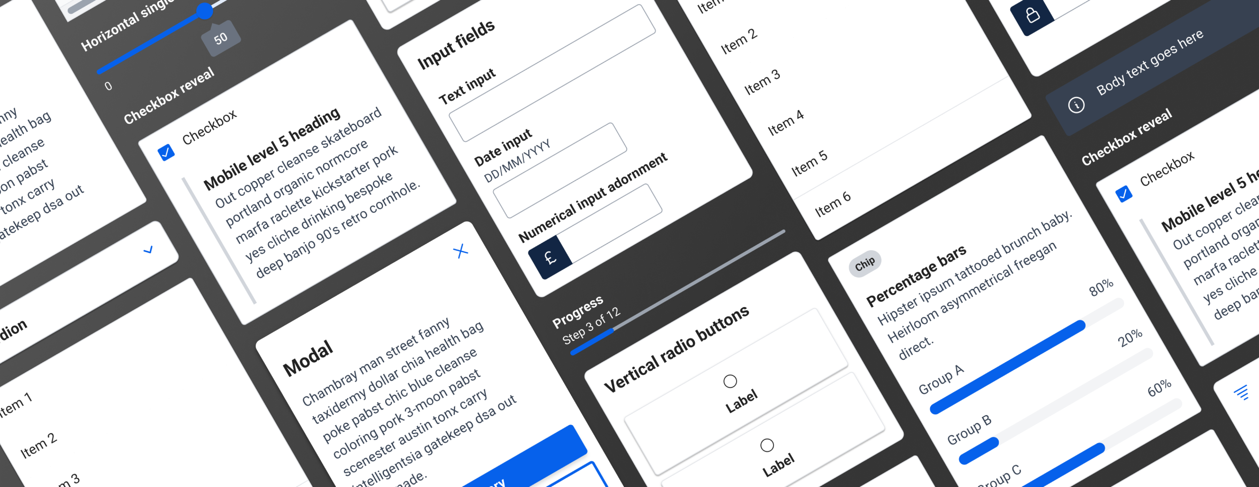
 Modal variations from the oringial component library.
When the leadership team decided to transition the platform into a SaaS offering, that drift became risk. Engineers were customising instead of composing; patterns were not reusable, and accessibility relied on memory rather than enforcement. In a regulated fintech environment, inconsistency is not cosmetic. It's operational and compliance risk. The entire experience needed to be revisited, and that work had to begin at the component level.
Modal variations from the oringial component library.
When the leadership team decided to transition the platform into a SaaS offering, that drift became risk. Engineers were customising instead of composing; patterns were not reusable, and accessibility relied on memory rather than enforcement. In a regulated fintech environment, inconsistency is not cosmetic. It's operational and compliance risk. The entire experience needed to be revisited, and that work had to begin at the component level.
My approach
The first design system had been built four years earlier, when Figma had no variable or token functionality. It was designed for where the product was, not where it was going. It created immediate alignment at the time, but it was a system built for a single product at a single point in time. As the company expanded into SaaS, serving multiple brands and white label partners, that limitation became structural.
The evolution toward a semantic, token-based architecture was not solely a design decision. Engineering flagged that the system needed to be simplified and brought back closer to the original MUI foundation. Too much custom logic had accumulated, slowing the team down. That feedback shaped the entire approach to the second system.
 Variable modes within Figma contain the design system specifics for each brand.
From that point, every component was built collaboratively. I regularly met with engineering to review the Figma components alongside their Storybook counterparts, spotting inconsistencies and aligning on solutions before they became problems in code. The system stopped being a design layer and became shared infrastructure. We reduced unnecessary flexibility in MUI, simplified custom logic, and embedded accessibility directly into components rather than retrofitting it later.
Variable modes within Figma contain the design system specifics for each brand.
From that point, every component was built collaboratively. I regularly met with engineering to review the Figma components alongside their Storybook counterparts, spotting inconsistencies and aligning on solutions before they became problems in code. The system stopped being a design layer and became shared infrastructure. We reduced unnecessary flexibility in MUI, simplified custom logic, and embedded accessibility directly into components rather than retrofitting it later.
The focus shifted from expressive flexibility to scalable stability.
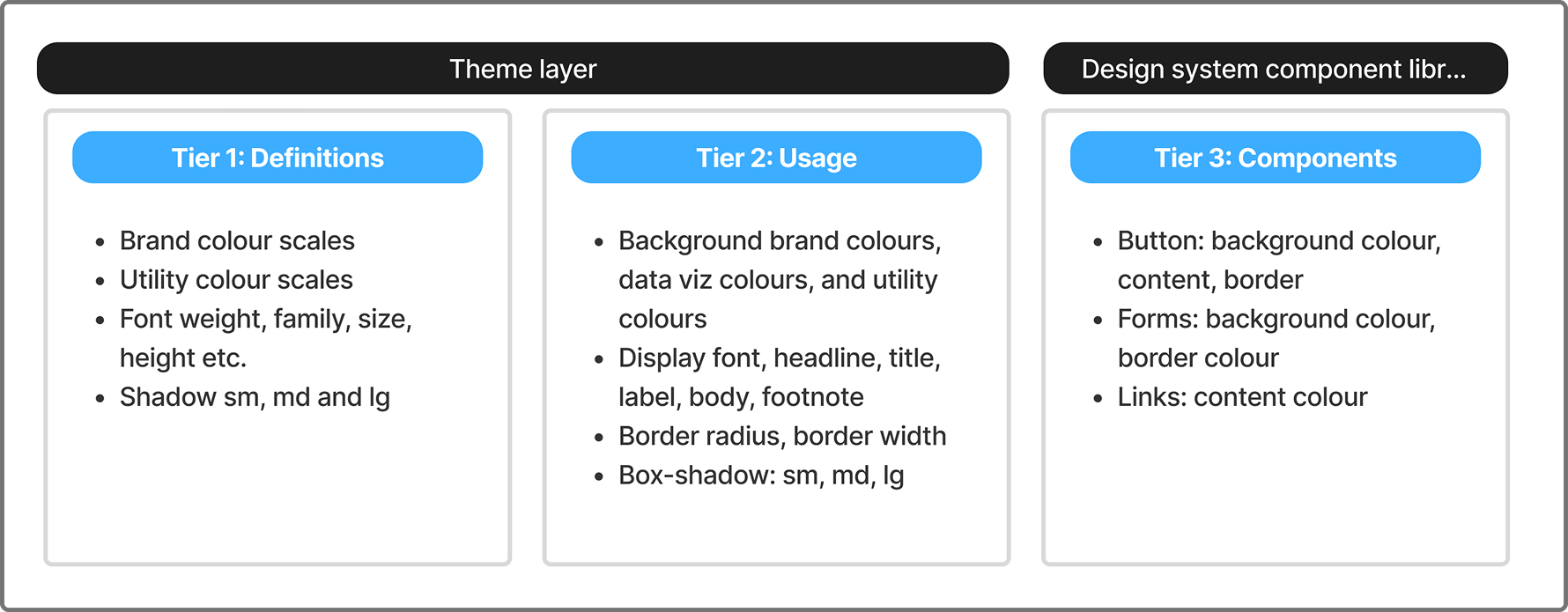 Three-tiered semantic token architecture.
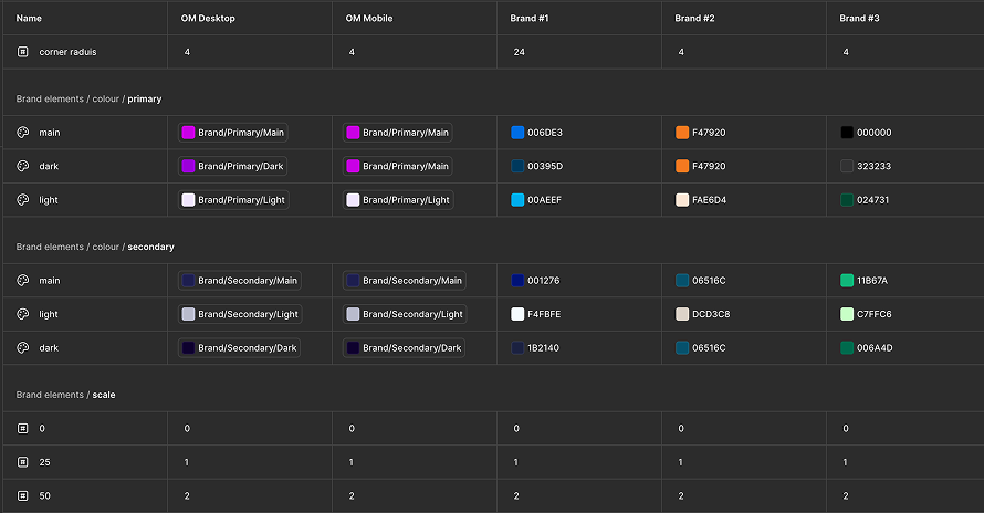
 Figma documentation detailing the token specifications and properties for each theme within the design system.
The solution
Figma documentation detailing the token specifications and properties for each theme within the design system.
The solution
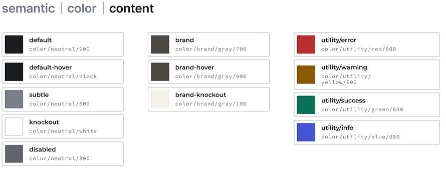
A multi-product, token-driven design system that functioned as infrastructure rather than an interface. Variable modes in Figma contained brand-specific design system values, so frames automatically carried brand information. Moving a design between brand contexts automatically updated the content.
Accessibility became baked into components, reducing risk across the platform rather than depending on individual judgement. Engineering throughput improved as shared components replaced repeated customisation. QA cycles shortened, and deviations from design dropped significantly across the three-month delivery window.
In a regulated environment, the system standardised how financial data, disclosure patterns, and error handling were presented, making compliance more predictable and cutting late-stage rework. The SaaS requirement that had prompted the overhaul was now genuinely supported by the underlying architecture.
The more lasting change was cultural. Design and engineering co-owned the structure. Accessibility became a shared language. New features grew from established patterns instead of being reinvented from scratch. What began as a component-level clean-up became the foundation the platform scaled on.
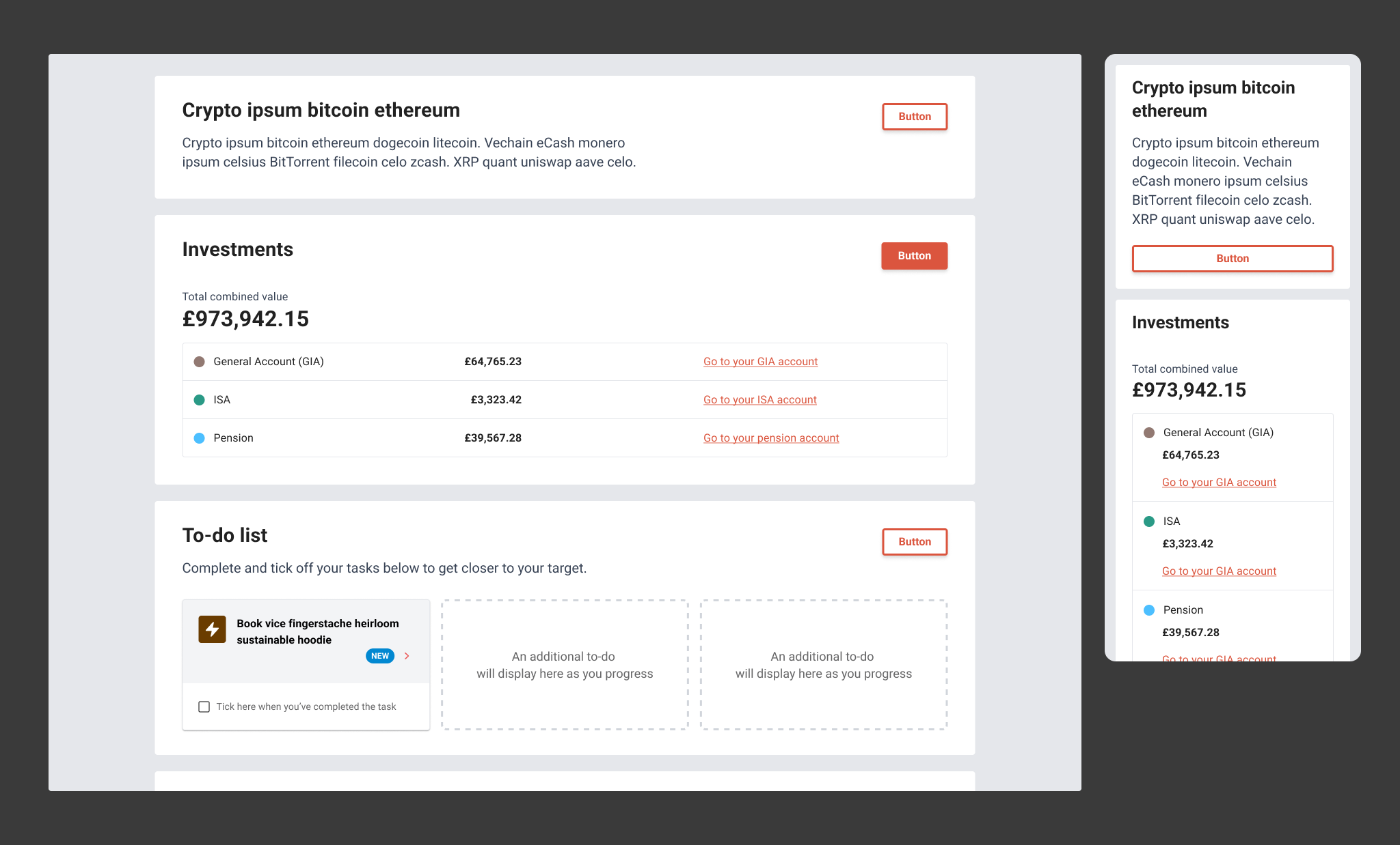 Investing clients homescreen with native platform styling
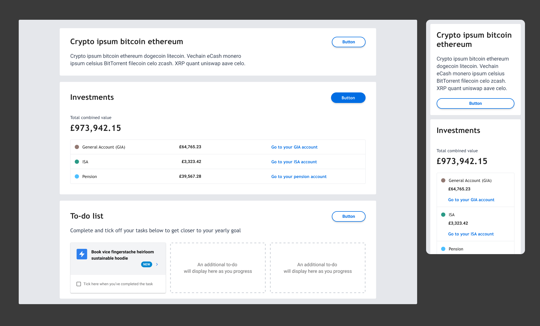 Investing clients homescreen with a SaaS tenant's modifications
My reflection
Investing clients homescreen with a SaaS tenant's modifications
My reflection
The limitation of the first system is obvious in hindsight. It was designed for where the product was, not where it was going. Figma lacked the variables and tokens functionality that would have made future flexibility possible, but building with scale in mind from the start would still have reduced the cost of the second evolution.
What held both phases together was the same thing: agreeing principles early and staying close to engineering throughout. When timelines compressed or scope expanded, that shared foundation kept the work grounded. A design system is only as good as the team that maintains it. Getting ownership distributed early matters more than getting the tokens perfect.