Designing a payments app from the ground up
Fintech · Open Banking · Payments
Juno was a seed-stage fintech start-up with a clear ambition: eliminate late payments for individuals and SMEs by digitising the request-for-payment and invoicing process using Open Banking technology. I joined as the first designer.
There was no existing product, no brand, and no design system. The team was small and fully remote, working through the Covid pandemic. I was responsible for both product design and brand identity, which meant operating across two work streams simultaneously with Figma as my only tool.
My role
Head of Design · First design hire
1
Designer
2
User types
3
Distinct component sets: iOS, Android and web
10
Months to full launch on all 3 platforms
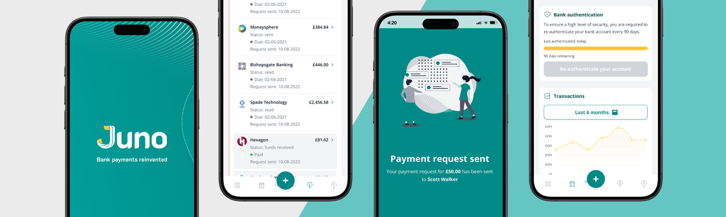
 Screens from Juno on iOS: payment request, welcome screen and account information screen.
The challenge
The brief was to design and ship an MVP, then keep iterating toward a full multi-platform product. In practice, that meant designing core web flows, extending them to native iOS and Android, and building a B2C variant for personal users, all while establishing a brand from scratch.
The pace left little room for formal research or usability testing, so decisions relied heavily on fintech experience and knowledge of user behaviour in regulated contexts. Stakeholder demands frequently competed with product priorities, and there were moments where the proposed UX needed to be challenged rather than just executed.
Designing for multiple platforms compounded the complexity. A web-first product built in React creates specific assumptions about layout, navigation, and interaction that do not translate directly to native mobile. Making the product feel genuinely native on iOS and Android, rather than simply responsive, required deliberate decisions at the component and pattern level.
What I did
I led the experience end to end, working closely with small developer team and a PM to define requirements and agree what done looked like for each feature. I established a lightweight design system early, opting for an off-the-shelf component library as a foundation rather than building from scratch, which kept delivery on track without sacrificing consistency.
The web product was designed with the React component model in mind, keeping the gap between design and build as tight as possible. When the product expanded to mobile, I treated iOS and Android as distinct design problems rather than a single adaptive layout.
 iOS and Android screens side by side, showing how native design conventions were applied across both platforms.
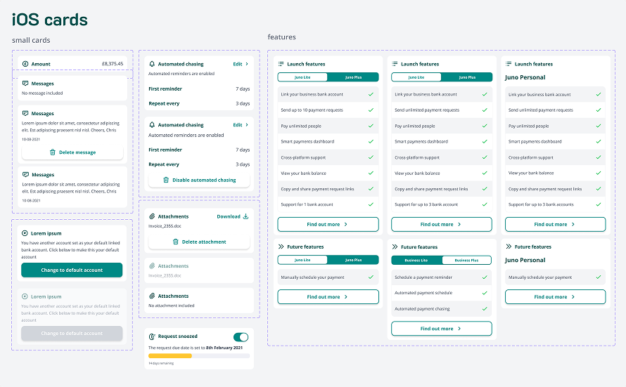
 A snapshot of the component library showing how shared components were adapted to meet iOS and Android design conventions.
Navigation was one of the clearest areas of divergence. iOS received tab bar navigation and respected Apple's back-gesture conventions. Android followed Material Design principles, with bottom navigation and the back stack behaviour users expect. Header patterns, step indicators, and the placement of back and next controls all differed between platforms for the same reason: getting these details wrong makes a financial product feel untrustworthy.
A snapshot of the component library showing how shared components were adapted to meet iOS and Android design conventions.
Navigation was one of the clearest areas of divergence. iOS received tab bar navigation and respected Apple's back-gesture conventions. Android followed Material Design principles, with bottom navigation and the back stack behaviour users expect. Header patterns, step indicators, and the placement of back and next controls all differed between platforms for the same reason: getting these details wrong makes a financial product feel untrustworthy.
Action and menu patterns were handled the same way. iOS used bottom sheet overlays for contextual actions, consistent with native conventions. Android received full-screen dialogs or Material bottom sheets as appropriate. The functionality was identical; the presentation was platform-specific.
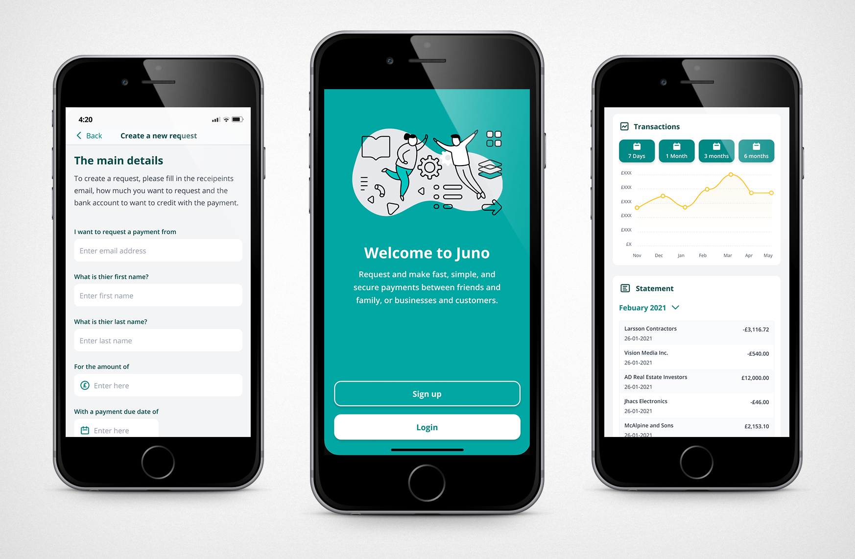
 Screens from the B2C personal account experience, covering key moments in the send and request money journey.
The B2C product was not a separate application but a parallel experience within the same product. Account type, business or personal, determined which journey a user entered after onboarding. I designed the branching logic and the differentiated flows for each, first for web, then adapted to both mobile platforms.
Screens from the B2C personal account experience, covering key moments in the send and request money journey.
The B2C product was not a separate application but a parallel experience within the same product. Account type, business or personal, determined which journey a user entered after onboarding. I designed the branching logic and the differentiated flows for each, first for web, then adapted to both mobile platforms.
What shipped
The product launched into the iOS App Store and Google Play on schedule. Over ten months, I delivered a complete web product covering all core payment and invoicing flows, native iOS and Android apps with platform-appropriate design throughout, a B2C experience branched from the same product, a functional design system used by the development team in production, and a full brand identity including logo, colour palette, and illustration style.
The design maturity of the company was early-stage by necessity. What kept things coherent was visibility: Notion and ProductBook gave the whole team a shared view of what was in progress, what was ready for development, and what was blocked. Without that, I do not think we would have remained on track.
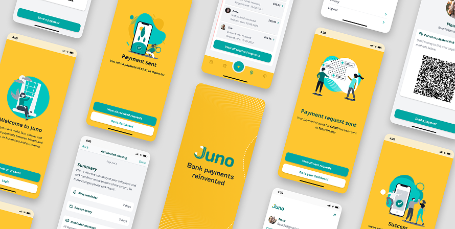
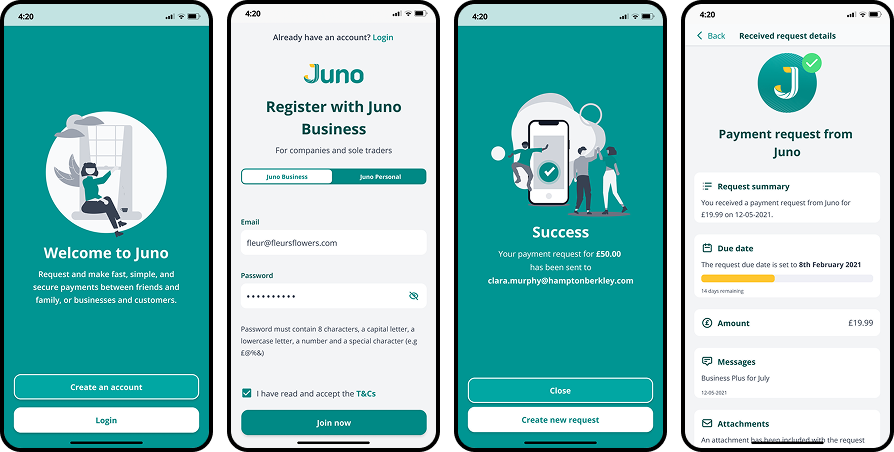 Shipped iOS screens from the B2B experience.
My reflection
Shipped iOS screens from the B2B experience.
My reflection
Working at this pace without usability testing sharpened my instincts, but it also reinforced why validation matters. Evidence of user preference and behaviour is not just useful for improving the product. It is what gives stakeholders the confidence to keep investing. In retrospect, earlier testing might have extended the runway.
The other thing I took from this project is that strategic shortcuts are not compromises. Adopting a ready-made component library, sourcing illustration assets rather than illustrating from scratch, being direct about what would and would not be prioritised: these were the decisions that made delivery possible without sacrificing quality where it counted.
The most important design decisions were often not about the screens themselves. They were about what to question, what to simplify, and what to protect.